For this assignment, I was asked to create a poster advertisement for my website. The concept is like the website subtle and straightforward. Users should feel like they are focusing on the content and not the usability of the website. In the creation of this poster, I focused on branding. By highlighting the features of the site in the advertisement, a user can create a concept of the purpose of the sign. The sign can be used to promote social media like Facebook and Twitter.
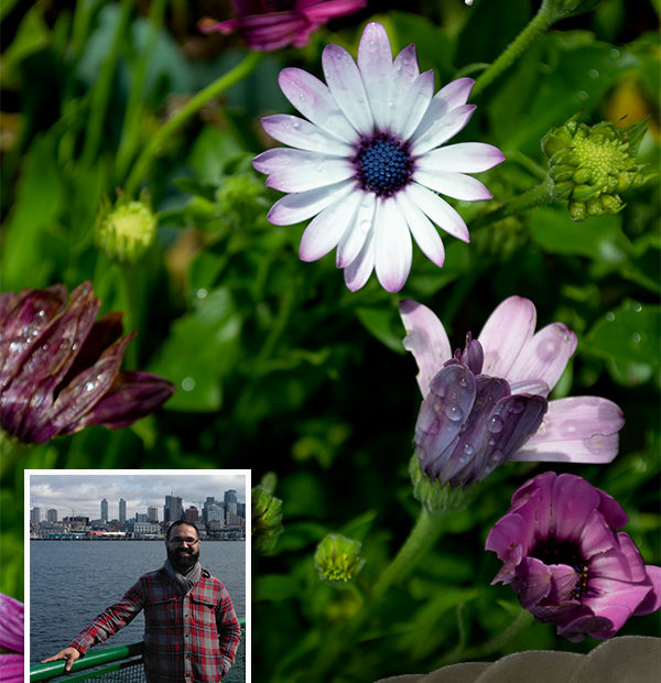
I focused on using the Rule of Thirds in this poster. Your attention is immediately drawn to the white flower and above it is the website name. As you are following the rows of flowers your attention is drawn down to the image of the publisher. Next to the image are the focuses of the website.
The significance of the images is relevant to the author of the blog. The background image is part of the photography work of the blogger. By placing a stroke on the border of the image of the author a user can gain create a visual relationship with the author. Creating a drop shadow behind the text brings the words forward and away from the images.
All the images on the poster were captured by me on my Nokia DSLR or on my ZTE phone camera. Often, I go out and wonder. I enjoy observing how light plays with how we interpret things. The image on the cover is much bigger than what is shown. It encompasses the cycles of a flower in one image. From birth to death, the flowers in this bush change colors as they mature. I happened to catch this image after a short rainfall in the afternoon. The sun came out and I was able to play with my aperture to capture the beauty in life and death.
My process for creating the design on the Adobe software is as follows: First, I opened the program. Then I set the parameters as requested for the assignments and threw my pictures in the file. I toyed around with clone stamping, stroking of the images, and opacity levels. Next, I created the text I needed and set its blending levels to stand out from the other images. Then I let the images talk to me. I did not know the orientation in which I wanted to go. Finally, I came out with this current layout.
The toughest technical challenge I had with this layout is I am not much of a graphic designer and I thought we would focus our writing on a pseudo-blog. It is difficult for me without input to execute the idea. I hope my group will have some good feedback to go further on the design.