Welcome back to another exciting post of the design process behind creating Havana Mary. In this blog, we will discuss the audience we are targeting for our blog. Through defining our audience we will design an advertisement meant to target those we are interested in reading our blog. I will discuss the design theories implemented for our design from concept, to drafting, to final.
Audience / User Profile
The target audience of this blog is located in the Seattle/King County area. The profile of the typical user (hereby named Joey) of our website will identify as white and tech-savvy. Their ages are between twenty-one to forty. Their income levels will vary. They are interested in culture and participating in cultural events and activities. Joey considers themselves a foodie and enjoys both cooking and eating out. Joey is adventurous yet conservative in their approach to new things. They prefer to take things in “one foot at a time” rather than “dive in”.
To execute an advertisement that will appeal to our target audience we will need to use fundamental elements and principles of design.
Theories Used
One especially important theory to be used in our design is the Gestalt Theory of visual design. Unity and harmony will be achieved when elements in the design are grouped together to create a cohesive theme. Primarily Gestalts Theory focuses on the five laws of hierarchy, proximity, similarity, continuation, and closure.
Typography will be an essential element of the design which will communicate the message in readable form and bring the design altogether. The combination of serif and sans serif typeface will group the ideas of the theme layout together cohesively.
Design Process
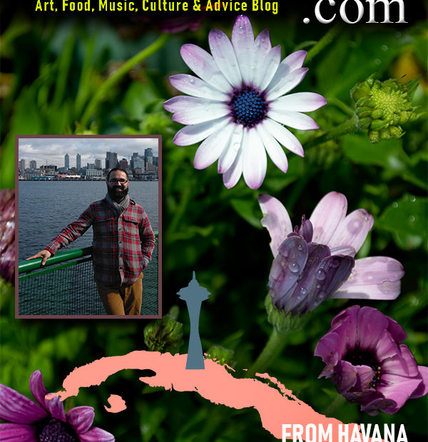
I decided to create a poster advertisement for my website. The purpose of the blog itself is for users to feel like they are focusing on the content and not the usability of the website. In the creation of this poster, I focused on branding by using a Mongolia Baiti typeface with a regular font style. I enhanced the lettering by at a bevel and drop shadow to create contrast from the background image.
Using Gestalt’s Rule of Thirds, I organized the elements in the layout from the top-down, grouping relevant concepts. Displaying the name of the blog and its focuses created one-third of the layout. The colorful background image itself serves the middle third of the layout. Your attention is drawn down from the flowers to the image of the author, over to the outline of Cuba and the Space Needle ending with text as the attention final third.
The significance of the images is relevant to the author of the blog. The background image is part of the photography work of the blogger. Placing a stroke on the border of the image creates contrast and depth but remains relevant to the concept. The image was taken of the author with Seattle in the backdrop on a ferry. Images were produced by the author using a Nikon DSLR and ZTE phone camera. Often, I go out and wonder. I enjoy observing how light plays with how we interpret things. The image on the cover is much bigger than what is shown. It encompasses the cycles of a flower in one image. From birth to death, the flowers in this bush change colors as they mature. I happened to catch this image after a short rainfall in the afternoon. The sun came out and I was able to play with my aperture to capture the beauty in life and death.